Very cool data visualization
Reshared post from +Matthew Hawn
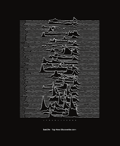
Last.fm's Best of 2011 is up today – summarising what the world actually listened to in 2011 across 20 countries and 15 different tags/genres. One of our designers, +Paul Blunden, did an amazing data visualisation of the top 80 artists who had their first scrobble in 2011. Each line is the scrobble history of that band in 2011.
The data is real and the image should be familiar to some of you…
You can read about Best of 2011 and download the poster for free at our blog: http://blog.last.fm/